🎨 Color Picker Element
The Color Picker element in FormNX allows you to collect color selections from users in a simple and interactive way. Instead of asking users to manually type color codes, they can visually choose a color directly from the picker.
This guide will walk you through how to add and customize the Color Picker element in your form.
📌 How to Add the Color Picker Element
Follow these simple steps:
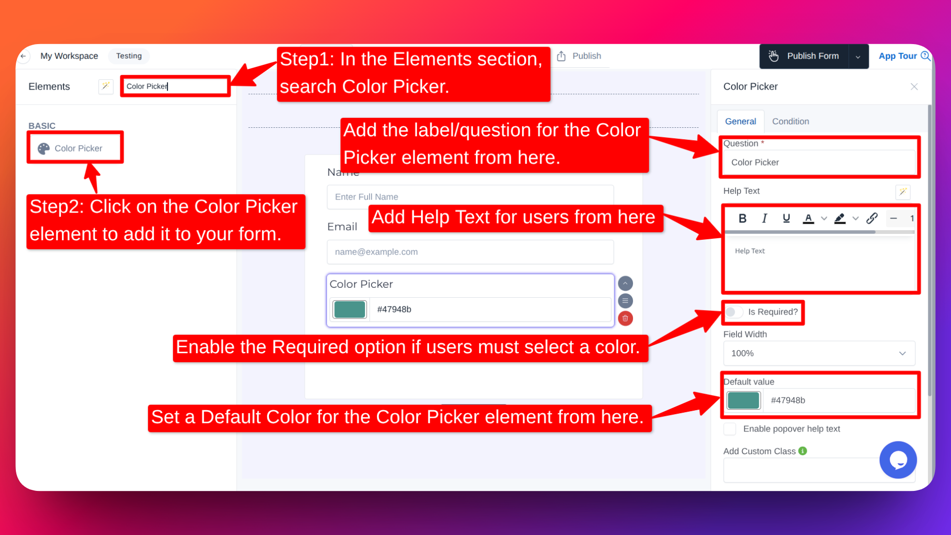
- Go to the Form Builder.
- On the left hand side you will see the Elements section.
- Search for Color Picker.
- Drag and drop the Color Picker element into your form OR Click on the element to add it automatically.
Once added, the element will appear in your form layout.
⚙️ How to Customize the Color Picker
To customize the element:
- Click on the Color Picker field in your form.
- The element settings panel will open on the right hand side.
You can configure the following options:
- Edit the Question / Label ✏️
- Change the field label from the Question option.
- Example:
- "Choose Your Brand Color"
- "Select Your Preferred Background Color"
- Add Help Text 📝
- Provide additional instructions to users.
- Example:
- "Select the color that best matches your logo."
- "Choose a theme color for your event."
- Make the Field Required ✅
- Enable the Required option if users must select a color before submitting the form.
- Set a Default Color 🎯
- You can pre-select a default color.
- This is helpful when:
- You want to suggest a recommended color.
- Most users usually choose the same color.
- Built-in Validation 🔎
- FormNX automatically validates HEX color codes.
- If a user enters an invalid value, the form will prompt them to correct it.
👤 How It Works for Users
When users open the form:
- They can click on the Color Picker.
- A color selection panel will appear.
- They can:
- Choose a color visually
- Or enter a valid hex color code
- After selecting their preferred color, they can submit the form normally.
Common Use Cases for the Color Picker Element
The Color Picker element is useful in many real-world scenarios, such as:
- Branding forms - Collect brand or logo colors
- Design requests - Let clients choose UI or theme colors
- Product customization forms - Allow customers to select product colors
- Event planning forms - Choose decoration or theme colors
- Marketing requests - Capture preferred campaign or banner colors
🚀 Why Use the Color Picker?
- Makes forms more interactive
- Reduces manual input errors
- Automatically validates hex codes
- Improves user experience
- Helps collect precise color information
The Color Picker element makes it easy to collect accurate and visually selected color inputs in your forms - all without any coding.