✏️ Input Field
Input fields are the most common way to collect written responses from users in a form. FormNX provides two types of input field elements:
- Short Text — for single-line responses (names, titles, subjects, etc.)
- Long Text — for multi-line responses (descriptions, feedback, comments, etc.)
Both elements let users type their answers freely, and you can fully customize how each field looks and behaves from the configuration panel.
📌 How to Add an Input Field to Your Form
Follow these simple steps:
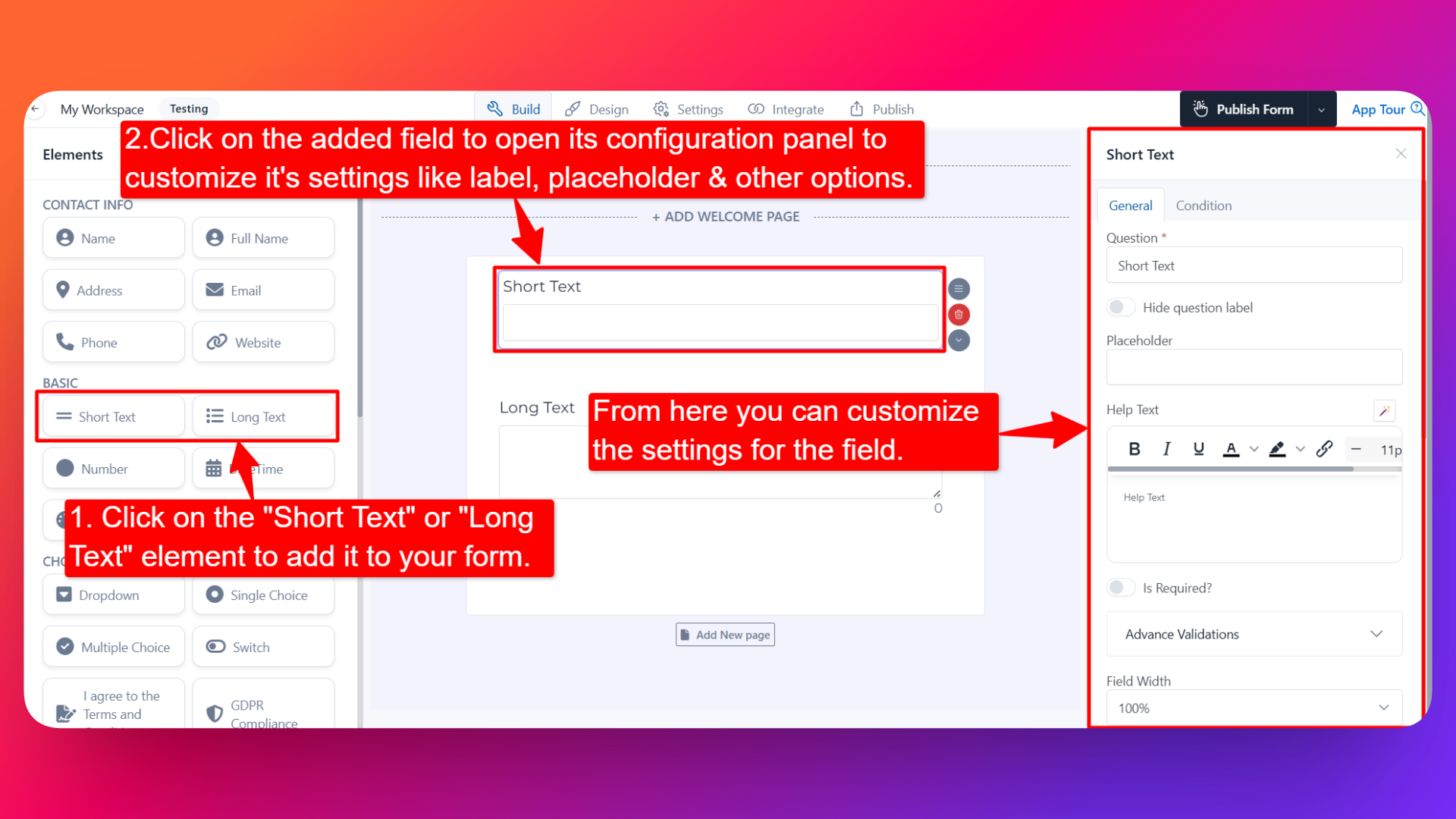
- Open the Form Builder.
- On the left hand side, you'll see the Elements section.
- Find the Short Text or Long Text element.
- Drag and drop the element onto your form OR click on the element to add it automatically.
Once added, the input field will appear in your form layout, ready to be customized.
⚙️ How to Configure the Input Field
To customize the field:
- Click on the Short Text or Long Text element in your form.
- The configuration panel will open on the right hand side.
From here, you can configure the following options:
- Question Label ✏️
- Add the question or label that users will see for this field.
- Example:
- "What is your job title?"
- "Tell us about your experience"
- Is Required ✅
- Enable the Is Required option to make the field mandatory.
- Users won't be able to submit the form unless they fill in this field.
- Help Text 📝
- Add a short instruction or hint below the field to guide users.
- Example: "Please enter your response in English."
- Hide Label 🙈
- Enable the Hide Label option to hide the question label from users while keeping the input field visible.
- Useful when the field's purpose is already clear from context or placeholder text.
- Advanced Validations 🔎
- Add custom validation rules to control what users can enter (e.g., minimum/maximum length, allowed characters, patterns).
- Helps you collect clean and accurate data.
- Field Width 📐
- Adjust the width of the field to control how it appears on the form.
- Useful when placing multiple fields side by side.
- Prefix & Suffix Icons 🎨
- Add an icon at the beginning (prefix) or end (suffix) of the input field.
- Example: Adding a 🔍 prefix icon to a search field or a 💲 prefix for a price field.
- Default Value 🎯
- Pre-fill the field with a default value.
- Useful when most users would enter the same value, or when you want to suggest an example.
- Read Only 🔒
- Mark the field as Read Only so users can see the value but cannot edit it.
- Useful for displaying pre-filled information.
- Sensitive Data 🛡️
- Mark the field as Sensitive Data to handle the response with extra care (such as masking it in submissions).
- Useful for personal or confidential information.
- Hide Field 👻
- Hide the field from being visible to users in the form.
- Useful when you want to store data via integrations or conditional logic without showing the field directly.
📝 Extra Settings for the Long Text Field
In addition to all the configuration options above, the Long Text element includes two extra settings:
- Number of Rows & Columns 📏
- Set the size of the text area by adjusting the number of rows and columns.
- Useful when you expect users to enter longer responses and want the text area to be more visible.
- Display Character Count 🔢
- Enable this option to show a live character counter below the field.
- Helps users keep track of how many characters they've typed, especially useful when paired with a maximum length validation.
👤 How It Works for Users
When users open the form:
- They'll see the input field with the label and any help text you've configured.
- They can type their response directly into the field (single line for Short Text, multi-line for Long Text).
- If validations are added, they'll be prompted to correct invalid entries before submitting.
- If the field is marked as required, they must fill it in before submitting the form.
💡 Common Use Cases
- Short Text — Collect names, subject lines, job titles, company names, or short answers.
- Long Text — Collect feedback, descriptions, comments, suggestions, or open-ended responses.
The Input Field elements give you a flexible way to capture any kind of written input from your users — all without writing any code.