📊 Input Tables
The Input Table (Matrix) element in FormNX lets you collect structured, grid-based responses in a single field — perfect for matrix questions, comparison tables, multi-row data entry, and Likert-style surveys where the same question is asked across multiple rows.
You can choose a single input type for the whole table — single choice, multiple choice, dropdown, textbox, or numeric textbox — and every cell in the table will use that same input type.
📌 How to Add the Input Table to Your Form
Follow these simple steps:
- Open the Form Builder.
- On the left hand side, you'll see the Elements section.
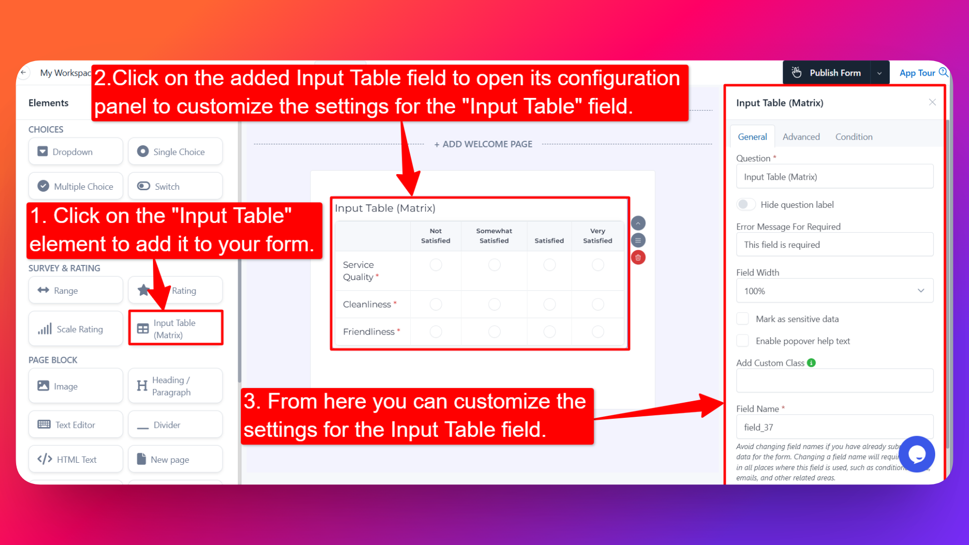
- Find the Input Table element.
- Drag and drop the element onto your form OR click on the element to add it automatically.
Once added, the Input Table will appear in your form layout, ready to be customized.
⚙️ How to Configure the Input Table
To customize the field:
- Click on the Input Table element in your form.
- The configuration panel will open on the right hand side.
- You'll see two configuration tabs: General and Advance.
🟢 General Settings
- Question Label ✏️
- Add the question or label that users will see for this field.
- Example:
- "Rate the following aspects of our service"
- "Provide details for each item"
- Hide Question Label 🙈
- Enable this option to hide the question label while keeping the table visible.
- Help Text 📝
- Add a short instruction or hint below the field to guide users.
- Example: "Please answer for every row."
- Error Message for Required ⚠️
- Customize the error message users see when a required row is left empty.
- Helps you display a clear, branded message instead of the generic default.
- Field Width 📐
- Adjust the width of the field to control how it appears on the form.
- Sensitive Data 🛡️
- Mark the field as Sensitive Data to handle the response with extra care (such as masking it in submissions).
- Popover Help Text 💡
- Enable this option to show your help text inside an info icon next to the field.
- When users click on the info icon, the popover will appear with the help text you added.
- Keeps your form clean while still giving users access to extra guidance when they need it.
- Field Name 🏷️
- Add a unique field name (used internally for integrations, exports, and conditional logic).
🟣 Advance Settings
- Input Method for Every Cell 🧩
Choose one input method for the whole table. The selected method will be applied to every cell in the table — you cannot mix different input types in different cells. Available options:
- Single Choice — Every cell becomes a radio button. Users can pick one column option per row (great for Likert-scale matrices).
- Multiple Choice — Every cell becomes a checkbox. Users can pick multiple column options per row.
- Dropdown — Every cell becomes a dropdown menu of column options.
- Textbox — Every cell becomes a free-text input where users type their answer.
- Numeric Textbox — Every cell becomes a number-only input.
Pick the input method that matches the kind of data you want to collect — and remember that the choice applies uniformly to all cells in the table.
- Rows 📋
- Define the row labels — these appear on the left side of the table.
- Enter one row per line when adding them.
- Example rows: "Customer Support", "Product Quality", "Delivery Speed".
- Columns 📊
- Define the column labels — these appear at the top of the table.
- Enter one column per line when adding them.
- Example columns: "Poor", "Fair", "Good", "Excellent".
- Is Required ✅
- Mark specific rows / questions as required.
- Users won't be able to submit the form unless they fill in every required row.
- Useful when some rows are critical (e.g., "Overall Rating") and others are optional.
👤 How It Works for Users
When users open the form:
- They'll see a grid with your defined rows on the left and columns across the top.
- Every cell in the table uses the same input method you configured (radio, checkbox, dropdown, text, or number).
- They fill in or select an answer for each row using that input type.
- If popover help text is enabled, users can click the info icon to see additional guidance.
- If any rows are marked required, those rows must be answered before submitting.
💡 Common Use Cases
- Likert-scale survey matrices — Rate multiple aspects on the same scale (set the table's input method to Single Choice).
- Multi-criteria evaluations — Compare products, services, or candidates across multiple dimensions.
- Availability grids — Capture availability across days (rows) and time slots (columns) by setting the input method to Multiple Choice.
- Product order forms — Set the input method to Numeric Textbox to enter quantities for multiple products.
- Skill assessments — Set the input method to Dropdown to capture proficiency level per skill.
- Feedback forms — Set the input method to Textbox to collect free-text comments for multiple aspects of an experience.
- Comparison tables — Let users provide structured input across a defined set of categories using a single, uniform input type.
The Input Table is a powerful way to collect a lot of related information in a single, compact field — saving form real estate while keeping the responses organized and easy to analyze.