📏 Scale Rating
The Scale Rating element in FormNX lets users rate something on a numeric scale with clearly labeled endpoints — for example, "0 = Not Likely" to "10 = Very Likely". It's the go-to format for NPS (Net Promoter Score), CSAT, Likert-style questions, and any survey where you want users to express their opinion on a defined range.
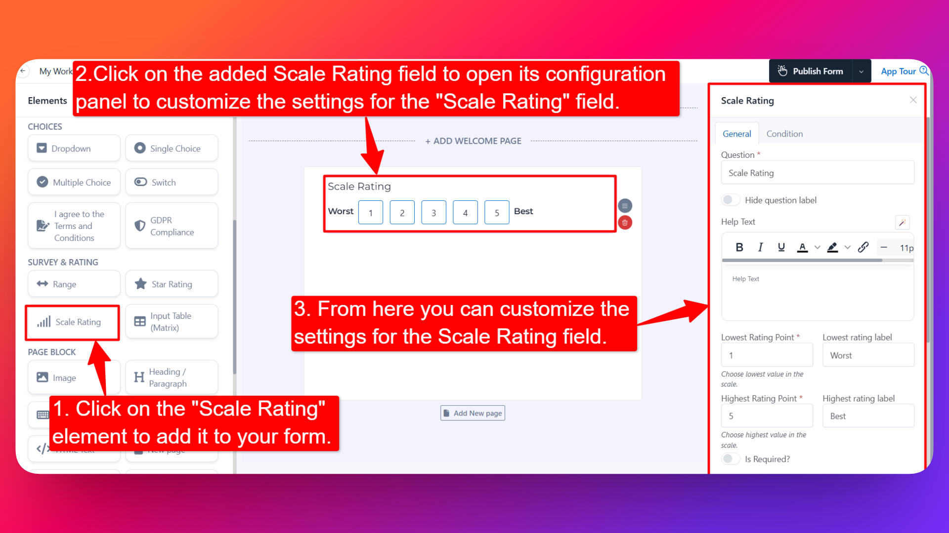
📌 How to Add the Scale Rating to Your Form
Follow these simple steps:
- Open the Form Builder.
- On the left hand side, you'll see the Elements section.
- Find the Scale Rating element.
- Drag and drop the element onto your form OR click on the element to add it automatically.
Once added, the Scale Rating will appear in your form layout, ready to be customized.
⚙️ How to Configure the Scale Rating Field
To customize the field:
- Click on the Scale Rating element in your form.
- The configuration panel will open on the right hand side.
You can configure the following options:
- Question Label ✏️
- Add the question or label that users will see for this field.
- Example:
- "How likely are you to recommend us to a friend?"
- "Rate your overall satisfaction"
- Hide Question Label 🙈
- Enable this option to hide the question label while keeping the scale visible.
- Help Text 📝
- Add a short instruction or hint below the field to guide users.
- Example: "0 = Not at all likely, 10 = Extremely likely."
- Lowest Rating Point 🔽
- Set the lowest number on the scale.
- This is the starting point of the rating range (commonly 0 or 1).
- Lowest Rating Label 🏷️
- Add a text label next to the lowest point.
- Example: "Not Likely", "Poor", "Strongly Disagree".
- Highest Rating Point 🔼
- Set the highest number on the scale.
- This is the ending point of the rating range (commonly 5 or 10).
- Highest Rating Label 🏷️
- Add a text label next to the highest point.
- Example: "Very Likely", "Excellent", "Strongly Agree".
- Is Required ✅
- Enable the Is Required option to make the field mandatory.
- Users won't be able to submit the form unless they pick a value on the scale.
- Field Width 📐
- Adjust the width of the field to control how it appears on the form.
- Sensitive Data 🛡️
- Mark the field as Sensitive Data to handle the response with extra care (such as masking it in submissions).
- Popover Help Text 💡
- Enable this option to show your help text inside an info icon next to the field.
- When users click on the info icon, the popover will appear with the help text you added.
- Keeps your form clean while still giving users access to extra guidance when they need it.
- Field Name 🏷️
- Add a unique field name (used internally for integrations, exports, and conditional logic).
👤 How It Works for Users
When users open the form:
- They'll see a row of numbered options between the lowest and highest rating points.
- The labels you've added appear at the two ends, giving context to what each end of the scale means.
- They can click on the number that best represents their opinion.
- If popover help text is enabled, users can click the info icon to see additional guidance.
- If the field is marked as required, they must select a value before submitting.
💡 Common Use Cases
- NPS (Net Promoter Score) — Classic 0–10 scale with "Not Likely" → "Very Likely" labels.
- CSAT (Customer Satisfaction) — 1–5 scale with "Poor" → "Excellent" labels.
- Likert-style survey questions — Scales like "Strongly Disagree" → "Strongly Agree".
- Product or feature feedback — Capture how strongly users feel about a specific item.
- Pain or severity scales — Useful in healthcare or support forms (0 = No pain, 10 = Severe pain).
- Difficulty or effort scores — Measure how easy or hard a task was for the user.
The Scale Rating field is purpose-built for surveys — clean, structured, and instantly understood by respondents who've taken any NPS or satisfaction survey before.