🎚️ Range Selector
The Range Selector element in FormNX is a slider-style field that lets users pick a numeric value by dragging a handle along a range. Instead of typing numbers, users simply slide to choose — making it perfect for budget pickers, satisfaction scores, age ranges, and any numeric input bound between a minimum and maximum value.
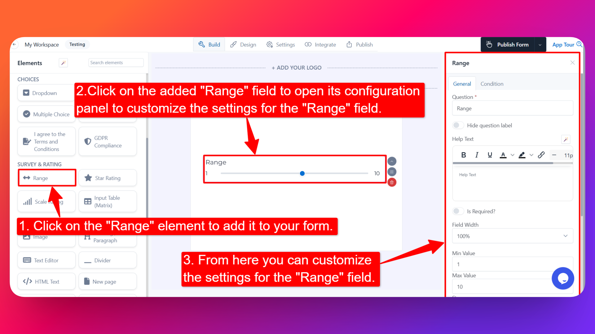
📌 How to Add the Range Selector to Your Form
Follow these simple steps:
- Open the Form Builder.
- On the left hand side, you'll see the Elements section.
- Find the Range element.
- Drag and drop the element onto your form OR click on the element to add it automatically.
Once added, the Range Selector will appear in your form layout, ready to be customized.
⚙️ How to Configure the Range Selector
To customize the field:
- Click on the Range Selector element in your form.
- The configuration panel will open on the right hand side.
You can configure the following options:
- Question Label ✏️
- Add the question or label that users will see for this field.
- Example:
- "Select your monthly budget"
- "How satisfied were you with our service?"
- Help Text 📝
- Add a short instruction or hint below the field to guide users.
- Example: "Drag the slider to select your preferred value."
- Hide Question Label 🙈
- Enable this option to hide the question label while keeping the slider visible.
- Is Required ✅
- Enable the Is Required option to make the field mandatory.
- Users won't be able to submit the form unless they interact with the slider.
- Field Width 📐
- Adjust the width of the field to control how it appears on the form.
- Min Value 🔽
- Set the lowest value the slider can go to.
- This is the value at the leftmost end of the range.
- Max Value 🔼
- Set the highest value the slider can go to.
- This is the value at the rightmost end of the range.
- Step 📐
- Set the increment value for each slider movement.
- Example: If Step = 5, the slider will jump from 0 → 5 → 10 → 15 → 20 (and so on) instead of moving one unit at a time.
- Useful when you only want users to pick specific intervals (e.g., budgets in increments of $100, age in increments of 5 years).
- Sensitive Data 🛡️
- Mark the field as Sensitive Data to handle the response with extra care (such as masking it in submissions).
- Field Name 🏷️
- Add a unique field name (used internally for integrations, exports, and conditional logic).
- Popover Help Text 💡
- Enable this option to show your help text inside an info icon next to the field.
- When users click on the info icon, the popover will appear with the help text you added.
- Keeps your form clean while still giving users access to extra guidance when they need it.
👤 How It Works for Users
When users open the form:
- They'll see the slider with the label, the min and max values, and any help text you've configured.
- They can drag the slider handle (or use arrow keys) to pick their preferred value.
- The slider moves in steps based on the Step value you set.
- If popover help text is enabled, users can click the info icon to see additional guidance.
- If the field is marked as required, they must interact with the slider before submitting.
💡 Common Use Cases
- Budget pickers — Let users pick their budget within a min–max range (e.g., $0 to $5,000 in steps of $100).
- Satisfaction or NPS scores — Capture how satisfied users are on a scale from 0 to 10.
- Age range pickers — Quick age selection in 5-year increments.
- Quantity selection — Pick how many items, hours, or units the user wants.
- Pricing tier selection — Let users slide between different price points or plan tiers.
- Survey responses — Capture numeric opinions on a scale (e.g., "How likely are you to recommend us?").
The Range Selector is a smooth, interactive way to collect numeric input — much more engaging than a plain number field, and visually intuitive for users.