🔽 Dropdown Field
The Dropdown element in FormNX lets users select one (or multiple) values from a list of predefined options — neatly packed inside a compact dropdown menu. It's the most space-efficient way to offer choices, especially when the list is long.
📌 How to Add the Dropdown Field to Your Form
Follow these simple steps:
- Open the Form Builder.
- On the left hand side, you'll see the Elements section.
- Find the Dropdown element.
- Drag and drop the element onto your form OR click on the element to add it automatically.
Once added, the Dropdown will appear in your form layout, ready to be customized.
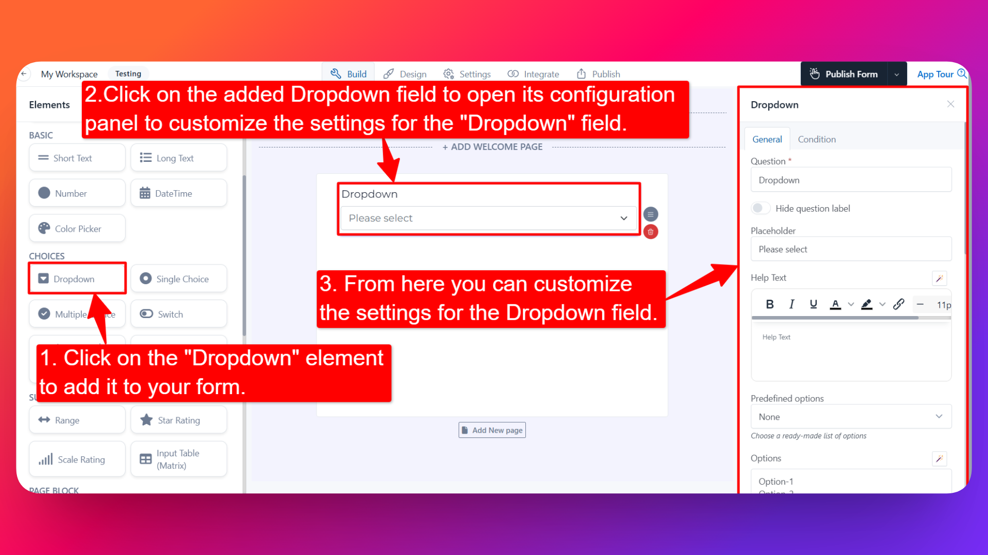
⚙️ How to Configure the Dropdown Field
To customize the field:
- Click on the Dropdown element in your form.
- The configuration panel will open on the right hand side.
You can configure the following options:
- Question Label ✏️
- Add the question or label that users will see for this field.
- Example:
- "Select your country"
- "Choose a subscription plan"
- Help Text 📝
- Add a short instruction or hint below the field to guide users.
- Example: "Pick the option that best describes your role."
- Hide Question Label 🙈
- Enable this option to hide the question label while keeping the dropdown visible.
- Is Required ✅
- Enable the Is Required option to make the field mandatory.
- Users won't be able to submit the form unless they select an option.
- Option Settings ⚙️
Inside Option Settings, you'll find the Calculation Value option:
- Calculation Value 🧮 — When enabled, you can assign a specific value to each option in the dropdown. This is extremely useful when:
- You want to assign different prices to different options (e.g., Basic Plan = $10, Pro Plan = $25, Enterprise = $100).
- You're using the form for scoring or quiz logic where each option contributes a different score.
- Field Width 📐
- Adjust the width of the field to control how it appears on the form.
- Placeholder Text 💬
- Add placeholder text that appears inside the dropdown before any option is selected.
- Example: "Select an option" or "Choose your country".
- Predefined Options 📋
- Choose a ready-made list of options instead of creating one from scratch.
- Useful for common option sets like Countries, Industries, Weekdays, Months, etc.
- If you don't need any predefined list, simply select None and add your own options manually.
- Add Options 📝
- Manually add the choices you want users to select from.
- You can add, remove, and reorder options easily.
- Default Value 🎯
- Pre-select a default option so it appears chosen when the form loads.
- Useful when most users would pick the same option.
- Prefix & Suffix Icons 🎨
- Add an icon at the beginning (prefix) or end (suffix) of the dropdown.
- Useful for visual cues like a 🌍 icon for a country selector.
- Allow Selection of Multiple Values 🔢
- Enable this option to let users select more than one option from the dropdown.
- You can also set a Maximum Limit for the number of options a user can select.
- Useful for "Select all that apply" style questions where you still want a compact dropdown UI.
- Allow Users to Type Option ⌨️
- Enable this option to let users type their own custom option if their choice isn't in the predefined list.
- Useful when you can't anticipate every possible answer.
- Sensitive Data 🛡️
- Mark the field as Sensitive Data to handle the response with extra care (such as masking it in submissions).
- Shuffle Option 🔀
- Enable this option to display the dropdown options in random order each time the form loads.
- Useful for surveys and research where you want to avoid order bias.
- Option Prefixing 🔤
- Add prefixes in front of each option for cleaner presentation. Choose from:
- No Prefixing — Options appear as-is.
- Letter Based (A, B, C, D) — Options are prefixed with letters.
- Number Based (1, 2, 3, 4) — Options are prefixed with numbers.
👤 How It Works for Users
When users open the form:
- They'll see the Dropdown with the label, help text, and placeholder you've configured.
- They can click to open the dropdown and select one option (or multiple, if enabled).
- If "Allow Users to Type Option" is on, they can type their own value when needed.
- If validations or required is enabled, they must select a value before submitting.
💡 Common Use Cases
- Country / state / city selectors in registration and address forms
- Plan and product selection with calculation values for pricing
- Industry, job role, or department dropdowns in lead and survey forms
- Multi-select tag pickers with a maximum limit (e.g., "Pick up to 3 interests")
- Predefined option lists like Weekdays, Months, or Languages
- Quiz or scoring forms where each option carries a different value
The Dropdown field is a flexible, space-saving way to capture user choices — whether you need a single selection, a multi-select with limits, or a pricing-aware list with calculation values.