🔛 Switch
The Switch element in FormNX is a toggle-style field that lets users quickly respond with an on/off or yes/no answer. Instead of typing or selecting from a list, users simply flip the switch — making it perfect for opt-ins, preferences, and simple boolean choices.
📌 How to Add the Switch Field to Your Form
Follow these simple steps:
- Open the Form Builder.
- On the left hand side, you'll see the Elements section.
- Find the Switch element.
- Drag and drop the element onto your form OR click on the element to add it automatically.
Once added, the Switch will appear in your form layout, ready to be customized.
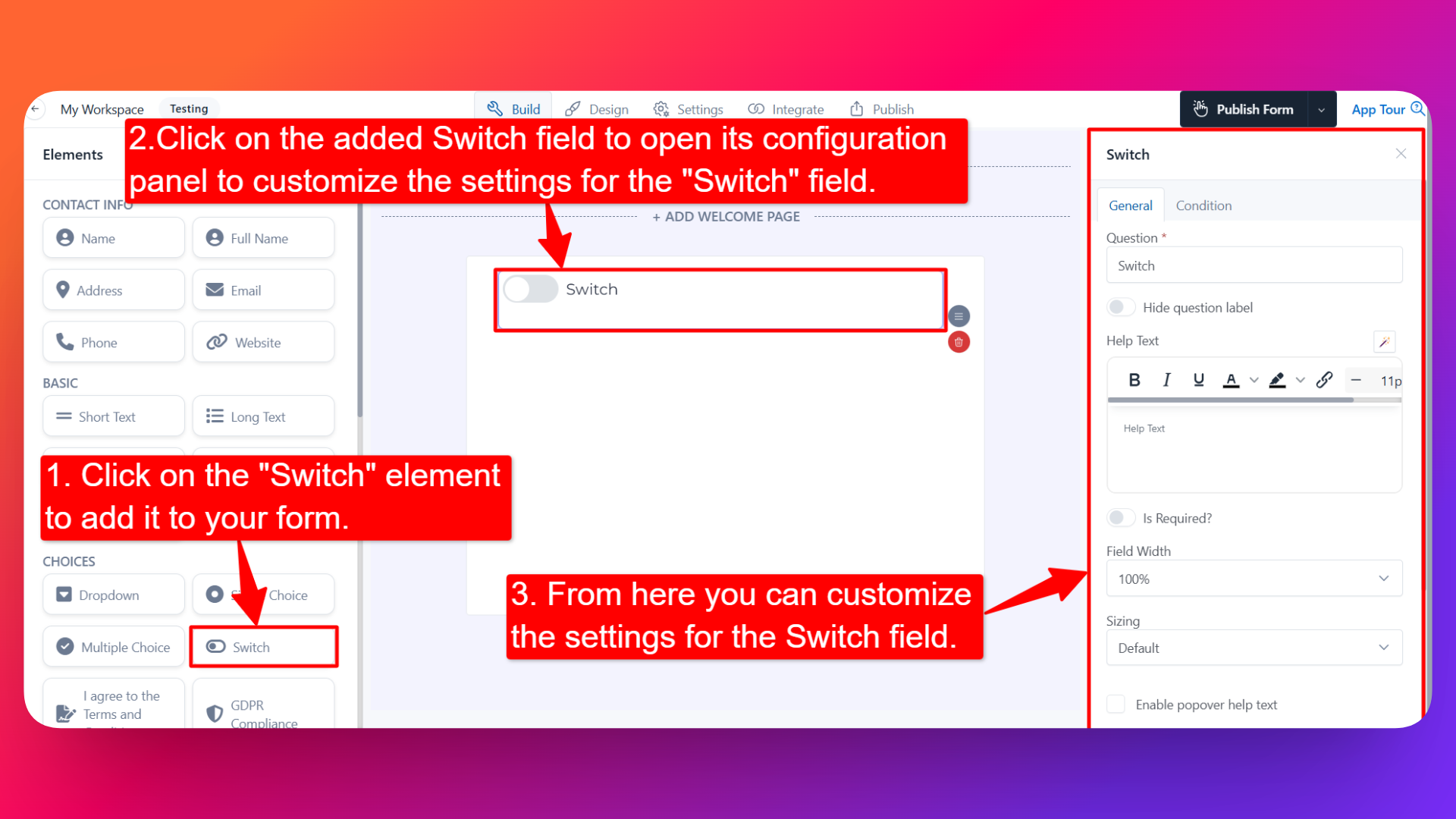
⚙️ How to Configure the Switch Field
To customize the field:
- Click on the Switch element in your form.
- The configuration panel will open on the right hand side.
You can configure the following options:
- Question Label ✏️
- Add the question or label that users will see for this field.
- Example:
- "Subscribe to our newsletter?"
- "Enable email notifications?"
- Help Text 📝
- Add a short instruction or hint below the field to guide users.
- Example: "Toggle on to receive weekly updates."
- Hide Question Label 🙈
- Enable this option to hide the question label while keeping the switch visible.
- Is Required ✅
- Enable the Is Required option to make the field mandatory.
- Users won't be able to submit the form unless the switch is interacted with.
- Field Width 📐
- Adjust the width of the field to control how it appears on the form.
- Useful when placing multiple fields side by side.
- Sizing 📏
- Select the size of the switch from three available options:
- Default — standard size, fits most forms.
- Large — bigger toggle, more prominent on the form.
- Small — compact toggle, useful in tight layouts.
- Field Name 🏷️
- Add a unique field name (used internally for integrations, exports, and conditional logic).
👤 How It Works for Users
When users open the form:
- They'll see the Switch with the label and any help text you've configured.
- They can simply click or tap to toggle it on or off.
- The response is captured as a true/false value in submissions.
💡 Common Use Cases
- Newsletter signups — "Subscribe to our newsletter?"
- Notification preferences — "Enable SMS alerts?"
- Opt-ins — "I'd like to receive promotional offers"
- Feature toggles — "Enable dark mode" or "Show advanced settings"
- Quick yes/no questions in surveys and feedback forms
The Switch element gives your form a modern, interactive feel and makes it effortless for users to share simple binary preferences.