🔘 Single Choice Radio Field
The Single Choice Radio element in FormNX lets users select exactly one option from a list of choices. Unlike a dropdown, all options are visible at once — making it ideal for short option lists where you want users to see every choice at a glance.
It also supports card-style designs and image options, so you can build visually rich choice questions for quizzes, product pickers, and engaging surveys.
📌 How to Add the Single Choice Radio Field to Your Form
Follow these simple steps:
- Open the Form Builder.
- On the left hand side, you'll see the Elements section.
- Find the Single Choice (Radio) element.
- Drag and drop the element onto your form OR click on the element to add it automatically.
Once added, the Single Choice field will appear in your form layout, ready to be customized.
⚙️ How to Configure the Single Choice Radio Field
To customize the field:
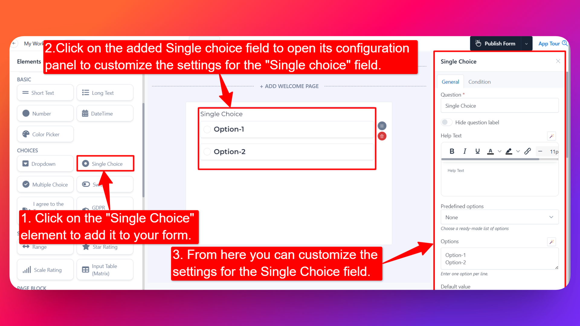
- Click on the Single Choice element in your form.
- The configuration panel will open on the right hand side.
You can configure the following options:
- Question Label ✏️
- Add the question or label that users will see for this field.
- Example:
- "What's your preferred contact method?"
- "Which plan suits you best?"
- Help Text 📝
- Add a short instruction or hint below the field to guide users.
- Example: "Select the option that best applies to you."
- Hide Question Label 🙈
- Enable this option to hide the question label while keeping the radio options visible.
- Is Required ✅
- Enable the Is Required option to make the field mandatory.
- Users won't be able to submit the form unless they select an option.
- Field Width 📐
- Adjust the width of the field to control how it appears on the form.
- Predefined Options 📋
- Choose a ready-made list of options instead of creating one from scratch.
- Common predefined lists include Gender, Weekdays, Months, and more.
- If you don't need any predefined list, simply select None and add your own options manually.
- Add Options 📝
- Manually add the choices you want users to select from.
- You can add, remove, and reorder options easily.
- Default Value 🎯
- Pre-select a default option so it appears chosen when the form loads.
- Useful when most users would pick the same option.
- Design 🎨
Select how the options will be visually presented:
- Simple — Standard radio buttons with text labels.
- Card — Each option appears as a clickable card, ideal for visually engaging choice questions (e.g., plan selection, product picker).
- Option Settings ⚙️
Inside Option Settings, you'll find two powerful options:
Calculation Value 🧮 — When enabled, you can assign a specific value to each option. This is extremely useful when:
- You want to assign different prices to different options (e.g., Standard Ticket = $50, VIP Ticket = $150).
- You're building a quiz or scoring form where each option contributes a different score.
- You want to drive dynamic pricing based on the user's selection.
Enable Image Option 🖼️ — When enabled, you can attach an image to each option, turning your radio field into a visual choice picker.
- First, select the image size: Small, Medium, or Large.
- Then add the image for each option of the field.
- Perfect for product selectors, design choice forms, and visual quizzes.
- Sensitive Data 🛡️
- Mark the field as Sensitive Data to handle the response with extra care (such as masking it in submissions).
- Shuffle Option 🔀
- Enable this option to display the choices in random order each time the form loads.
- Useful for surveys and research where you want to avoid order bias.
- Spread to Column 📊
- Spread the options into multiple columns on a single row.
- You can show 2 or 3 options per row (or more) based on your layout needs.
- Keeps long option lists compact and visually balanced.
- Option Prefixing 🔤
- Add prefixes in front of each option for cleaner presentation. Choose from:
- No Prefixing — Options appear as-is.
- Letter Based (A, B, C, D) — Options are prefixed with letters.
- Number Based (1, 2, 3, 4) — Options are prefixed with numbers.
- Field Name 🏷️
- Add a unique field name (used internally for integrations, exports, and conditional logic).
👤 How It Works for Users
When users open the form:
- They'll see all the options laid out (as simple radios, cards, or image cards depending on your design choice).
- They can click to select one option only — selecting a new option automatically deselects the previous one.
- If shuffle is enabled, the option order will be randomized each time the form loads.
- If the field is marked as required, they must select an option before submitting.
💡 Common Use Cases
- Plan & pricing selection — Pick a subscription plan with calculation values for prices.
- Quiz forms — Single correct answer per question with calculation values for scoring.
- Gender or demographic questions — Use predefined options like Gender.
- Visual product picker — Show product images and let users pick their favorite (with Image Option).
- Card-based feature selection — Display each option as a card for a modern, premium feel.
- Survey questions — Single-answer questions with shuffled options to avoid bias.
The Single Choice Radio field gives you all the flexibility you need — from simple radio buttons to fully visual, image-based, card-style choice questions.