➖ Divider
The Divider element in FormNX lets you add a visual separator between sections of your form. It's perfect for organizing long forms, grouping related fields, and improving the overall readability of your form.
📌 How to Add the Divider to Your Form
Follow these simple steps:
- Open the Form Builder.
- On the left hand side, you'll see the Elements section.
- Find the Divider element.
- Drag and drop the element onto your form OR click on the element to add it automatically.
Once added, the Divider will appear in your form layout, ready to be customized.
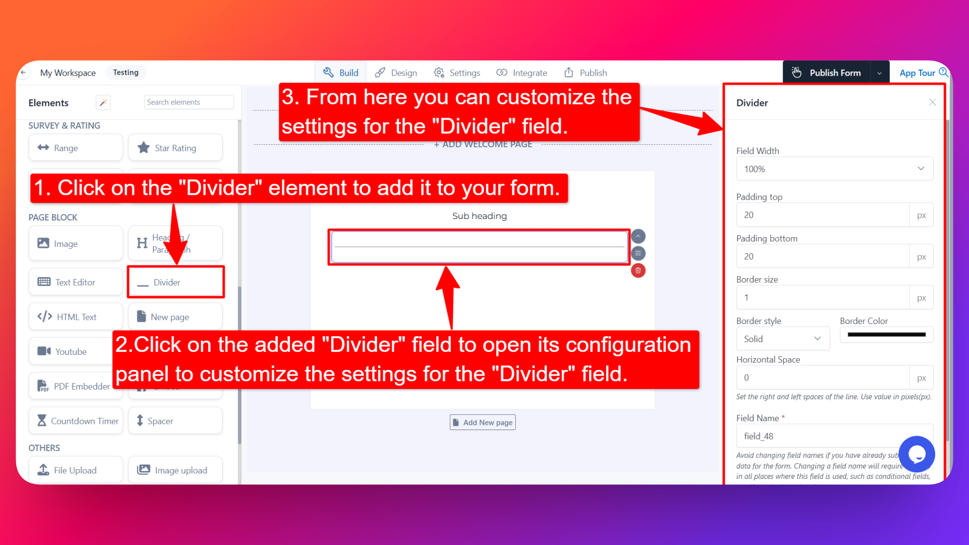
⚙️ How to Configure the Divider
To customize the Divider:
- Click on the Divider element in your form.
- The configuration panel will open on the right hand side.
From here, you can configure the following options:
- Field Width 📐
- Adjust the width of the divider to control how it appears on the form.
- Useful when you want the divider to span only part of the form.
- Padding Top (in px) ⬆️
- Set the space above the divider in pixels.
- Adds breathing room between the divider and the element above it.
- Padding Bottom (in px) ⬇️
- Set the space below the divider in pixels.
- Adds breathing room between the divider and the element below it.
- Border Size (in px) 📏
- Set the thickness of the divider line in pixels.
- A larger value creates a thicker, more prominent divider.
- Border Style 🎨
- Choose the style of the divider line:
- Solid
- Dashed
- Dotted
- Double
- Pick the style that best fits your form's design.
- Border Color 🌈
- Choose the color of the divider line to match your form's design or branding.
- Horizontal Space (in px) ↔️
- Set the horizontal spacing of the divider in pixels.
- Useful for controlling how far the divider extends across the form.
- Field Name 🏷️
- Set a custom field name used internally (helpful for identifying the element inside the form builder).
👤 How It Works for Users
When users open the form:
- They'll see the divider line displayed on the form, visually separating sections.
- The divider is display-only — users don't need to interact with it.
- It helps them understand the structure of the form and where one section ends and another begins.
💡 Common Use Cases
- Separating different sections of a long form (e.g., personal details vs. payment details).
- Creating visual breaks between groups of related fields.
- Improving the overall readability and structure of complex forms.
- Adding a clean design touch to multi-section forms.
The Divider element is a simple yet powerful way to improve the visual structure of your form and create a better user experience.