📝 Text Editor
The Text Editor element in FormNX is a rich text input field that lets users enter long, formatted responses. Unlike a regular long text field, the Text Editor gives users formatting controls so they can write detailed, well-structured answers.
📌 How to Add the Text Editor to Your Form
Follow these simple steps:
- Open the Form Builder.
- On the left hand side, you'll see the Elements section.
- Find the Text Editor element.
- Drag and drop the element onto your form OR click on the element to add it automatically.
Once added, the Text Editor will appear in your form layout, ready to be customized.
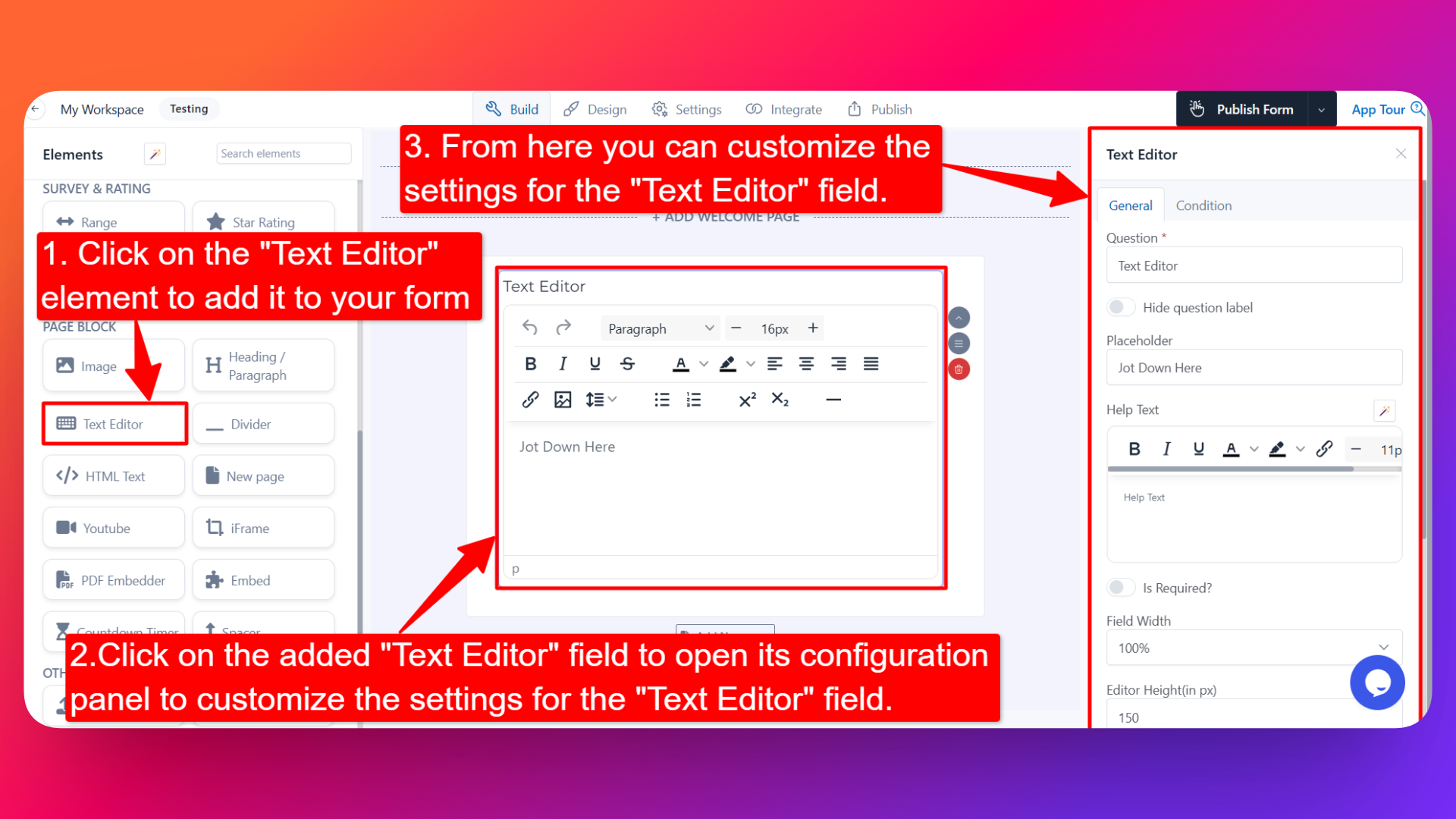
⚙️ How to Configure the Text Editor
To customize the Text Editor:
- Click on the Text Editor element in your form.
- The configuration panel will open on the right hand side.
From here, you can configure the following options:
- Question Label ✏️
- Add the question or label that users will see for this field.
- Example:
- "Describe your project in detail"
- "Share your feedback"
- Hide Question Label 🙈
- Enable the Hide Question Label option to hide the label from users while keeping the editor visible.
- Useful when the field's purpose is clear from context or placeholder text.
- Placeholder 💬
- Add placeholder text that appears inside the editor when it's empty.
- Helps guide users on what to write.
- Example: "Type your response here..."
- Help Text 📝
- Add a short instruction or hint below the field to guide users.
- Example: "You can use formatting options to style your response."
- Is Required ✅
- Enable the Is Required option to make the field mandatory.
- Users won't be able to submit the form unless they fill in this field.
- Field Width 📐
- Adjust the width of the editor to control how it appears on the form.
- Useful when placing multiple fields side by side.
- Editor Height (in px) 📏
- Set the height of the text editor in pixels.
- A larger height gives users more visible space to write longer responses.
- Mark as Sensitive Data 🛡️
- Mark the field as Sensitive Data to handle the response with extra care (such as masking it in submissions).
- Useful for personal or confidential information.
- Enable Popover Help Text 💡
- Enable this option to display the help text inside a popover (tooltip-style hint).
- Keeps the form clean while still providing guidance when users need it.
- Field Name 🏷️
- Set a custom field name used internally (helpful for integrations, exports, and conditional logic).
👤 How It Works for Users
When users open the form:
- They'll see the Text Editor with the label, placeholder, and any help text you've configured.
- They can type their response and use the formatting toolbar to style their text (bold, italics, lists, etc.).
- If the field is marked as required, they must fill it in before submitting the form.
💡 Common Use Cases
- Collecting detailed feedback or reviews from users.
- Capturing long descriptions like project details, bios, or articles.
- Allowing users to format their answers in support requests or contact forms.
- Gathering structured responses in applications, proposals, or survey forms.
The Text Editor gives you a flexible way to collect rich, formatted text responses from your users — perfect for any form where users need more than a plain text box.